Healthcare data visualization has emerged as a revolutionary practice, transforming how professionals interpret complex medical statistics.
Previously underrated, this powerful method has become a booming trend in the healthcare industry.
All thanks to the introduction of digital health management technologies.
Let us delve into health data visualization and understand its impact on healthcare processes.
Why is Healthcare Data Visualization Thriving?
Healthcare data visualization involves representing intricate medical data in a visually appealing and understandable format.
It enables users to gain
- Qualitative insights
- Identify patterns
- Discover trends (without requiring advanced math skills)
This practice was previously limited to a selective group of medical scholars and analysts.
However, the digital transformation of healthcare has democratized data visualization, making it accessible to physicians, nurses, and even patients.
The Benefits of Healthcare Data Visualization
1. Enhanced Data Insights for Physicians
Medical professionals can generate various graphs and charts with data visualization dashboards connected to EHR and EMR systems.
These healthcare data visualizations provide insights into individual
- Patient conditions
- Treatment plans
- Results
Physicians can also view performance metrics and time spent with patients, allowing for better resource allocation and improved patient engagement.
2. Better Disease Surveillance and Control
Healthcare data visualization aids in disease surveillance and control efforts.
By visualizing disease incidence rates and patterns, public health officials can
- Identify disease outbreaks
- Track the spread of infectious diseases
- Assess the effectiveness of vaccination
- Prevention measures
This proactive approach enables faster responses to potential health threats and helps contain outbreaks.
3. Efficient Medical Device Monitoring and Management
Healthcare data visualization plays a crucial role in the monitoring and management of medical devices used in patient care.
In real-time, medical professionals can visualize biosignal data, such as ECGs and vital signs.
Healthcare data visualization helps them optimize diagnostic quality and patient safety by
- Identifying anomalies
- Diagnosing accurately
- Adjusting medical devices
4. Identification of Trends and Predictive Analysis
Healthcare data visualization allows healthcare professionals to identify trends and patterns in patient data over extended periods.
Healthcare data analysis can provide valuable insights for correlations with factors like
- Seasonal changes
- Demographics
- Treatment protocols
Additionally, with the integration of artificial intelligence (AI) and machine learning (ML) technologies, healthcare data visualizations can be used for predictive analytics.
It enables healthcare providers to anticipate potential health issues and plan interventions accordingly.
5. Improved Patient Care and Outcomes
Healthcare data visualization allows providers to track and analyze patient data more effectively.
It leads to improved patient care and outcomes.
Visualizing patient data over time can help identify trends, patterns, and changes in health conditions.
Physicians can quickly interpret data, such as vital signs, lab results, and treatment responses.
It enables them to make timely and informed decisions about patient care.
6. Effective Communication with Patients
Infographics and motion graphics offer a simple and visually engaging way to communicate medical information to patients and the general public.
These educational tools help raise awareness about
- Disease prevention
- Symptoms
- Health-promoting practices
Patients are better equipped to participate in their own healthcare and make informed decisions by presenting complex medical concepts in an easy-to-understand format.
7. Versatility and Personalization
Healthcare data visualization offers versatility in presenting information to different audiences.
It allows for customized presentations, catering to the needs of stakeholders, investors, medical staff, and patients.
By tailoring visualizations to specific user requirements, healthcare organizations can ensure that each audience receives relevant and actionable information.
8. Data-Driven Decision Making
Healthcare data visualization empowers administrators and policymakers to make data-driven decisions.
Visualization of key performance indicators (KPIs) and other relevant metrics allows administrators to monitor the efficiency and effectiveness of healthcare processes.
They can identify areas that require improvement, allocate resources more effectively, and implement evidence-based strategies to enhance healthcare delivery.
How Healthcare Data Visualization Works?
Healthcare data for visualization is sourced from different types of healthcare technologies.
Three main components are crucial for achieving effective visualization.
1. Potential Sources of Healthcare Data for Visualization
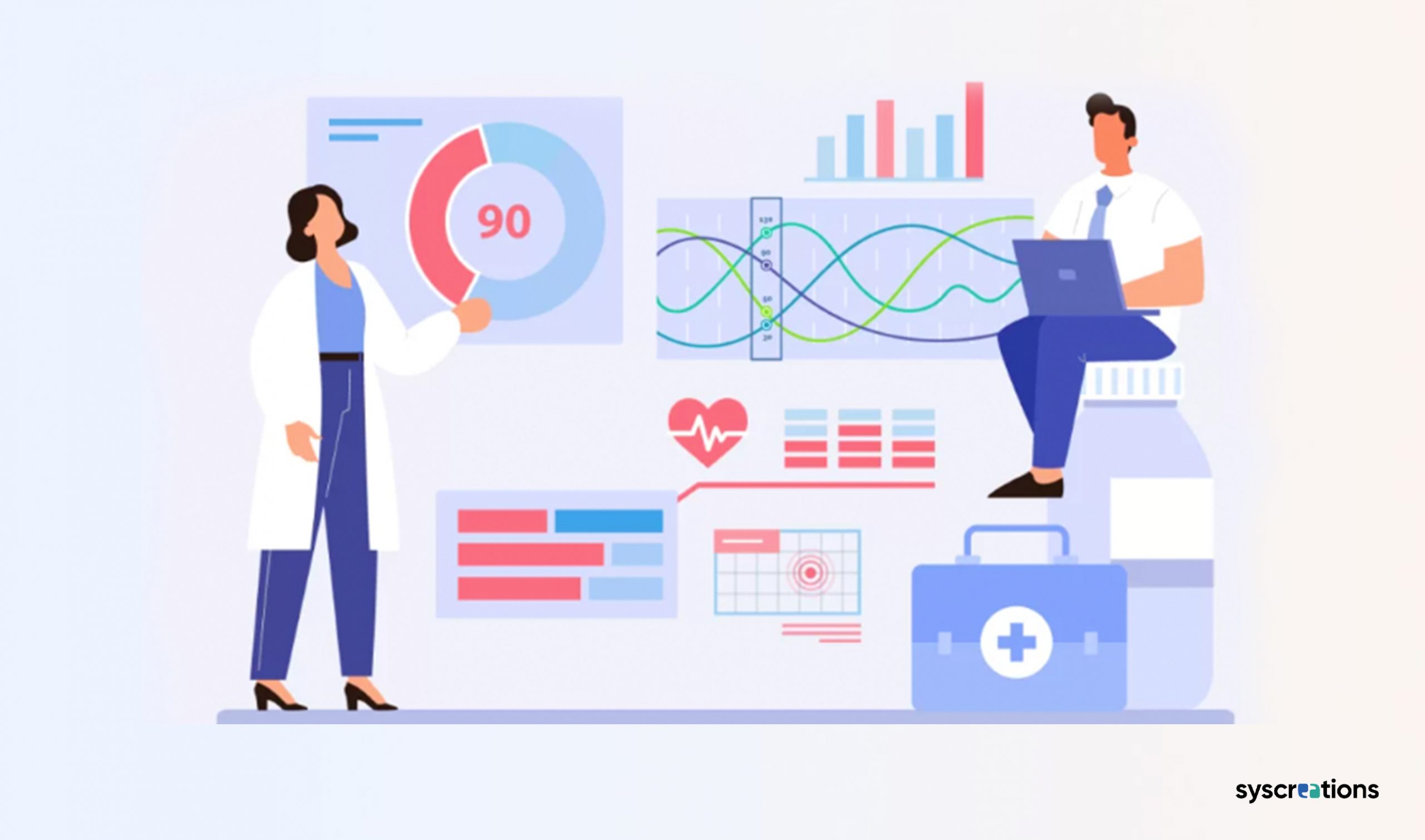
Healthcare data visualization relies on various sources of medical information, including:
a. EHRs and EMRs
EHR and EMR systems contain comprehensive patient health data, including
- Medical histories
- Diagnoses
- Treatment plans
- Physiological data from IoT medical devices
- Lab test results
These systems serve as a rich source of data for visualizations.
b. Data Collection Forms
Data can be collected from various sources, such as
- Health surveys
- Health tracking scorecards
- Patient self-reporting forms
- Insurance claims
- Insurance company databases
c. Clinical Trials
Medical research and clinical trials generated valuable health information recorded in databases and analyzed to gain deeper insights.
d. Wearable and Portable Devices
Wearable devices collect health data from individuals, offering diverse datasets for visualization. This data is usually collected from:
- Fitness trackers
- Pulse oximeters
- Wearable ECG monitors
- Wearable blood pressure monitors
e. Third-party Platforms
Data visualization can also involve integrating external Big Data platforms, cloud-based data stores, digitized patient archives, and API-based integrations for additional data sources.
2. Necessary Provisions for Healthcare Data Visualization
Three essential components need to be considered for effective healthcare data visualization.
a. Sufficient Amount of Medical Data
Data visualization thrives on well-structured, extensive medical data.
Access to vast volumes of data enables health professionals to create different types of charts covering prolonged periods.
It leads to better insight and comprehensive conclusions.
b. Well-Elaborated Mathematical Models
Underlying the healthcare data visualization process is a digital brain or software component containing well-founded mathematical logic and algorithms.
This mechanism must work flawlessly to convert medical data into visualizations.
It ensures precision and avoids the possibility of mistakes.
c. Conventional Clinical Data Visualization Toolbox and Interface
A user-friendly interface with easy-to-use controls is vital for medical professionals to benefit from visualized healthcare data without struggling with a steep learning curve.
The visualization management panel can be integrated into existing medical solutions like EHR/EMR client software or created as a standalone application for web or mobile platforms.
3. Tools and Methods for Healthcare Data Visualization
a. Interactive Dashboards
One of the most common and efficient methods is building charts through multi-functional dashboards.
Custom dashboards can include numerous tools and controls, such as
- Capturing vitality metrics (from patients)
- Adjustable filters
- Chart type selectors
- Search capabilities
b. ECG Graphs
Professional medical data visualization includes ECG charts or cardiograms, which require specific medical education and skills for interpretation.
These visualizations aid cardiologists in detecting and preventing cardiac illnesses.
c. Interactive Apps, Websites, and Widgets
Custom applications, web interfaces, or widgets can be developed for specific or limited data visualization functionalities.
These solutions can extract and visualize medical data from EMR/EHR or other patient databases.
d. Infographics and Motion Graphics
Infographics and animated videos are powerful educational tools, presenting medical information in a popular and easy-to-understand format.
These visualizations are useful for conveying public educational data to people with limited medical knowledge.
Healthcare Data Visualization Technology Examples
1. SAS Visual Analytics
SAS Visual Analytics is a web-based application that allows multiple users to access large volumes of updated data concurrently through the LASR analytic server, which holds data in memory.
It facilitates swift access to encrypted data and offloads computing burdens through parallel networking.
Use Case:
Bioaxis Healthcare, a prominent healthcare provider in Greece, utilizes SAS Visual Analytics to improve patient and customer service.
2. Tableau
Tableau is a business intelligence visualization tool that transforms unstructured data into structured formats, providing real-time insights.
It enables users to generate up-to-date knowledge by dynamically updating data.
Use Case:
Inova Healthcare, a reputable non-profit organization in Virginia, leverages Tableau to identify genetic illnesses promptly and provide timely treatment to affected individuals.
3. QlikView
QlikView is a business intelligence visualization tool that facilitates the integration of related data into electronic medical records.
It uses in-memory analysis to combine data from multiple sources, reducing service costs and minimizing medical errors by monitoring safety measures.
Use Case:
QlikView optimizes the scheduling process by maintaining a comprehensive list of patients and doctors on its scheduler server.
It ensures smooth information exchange between user applications.
It also ensures timely compliance with operational and patient safety indicators.
Steps to Apply Healthcare Data Visualization Effectively
1. Define Research Goals
Before delving into data visualization, it is crucial to understand the research objectives clearly.
This will help determine the required data, analysis methods, and the most suitable medical data visualizations to convey findings effectively.
2. Select Appropriate Visualization Types
Different data types call for specific visualization techniques.
For instance, consider using line or bar charts to showcase trends over time.
To illustrate relationships between variables, opt for scatter plots.
3. Tailor for Target Audience
Design the visualizations with the intended audience in mind.
Dashboards intended for physicians feature different metrics than those meant for patients or other healthcare professionals.
4. Ensure Clear and Concise Labeling
Labeling in visualizations must be unambiguous and succinct, accurately representing the displayed data.
This helps users interpret the information with ease and confidence
5. Highlight Key Insights
Emphasize the most critical findings relevant to the audience.
Use techniques like color coding, data point highlighting, or annotations to draw attention to these key insights.
6. Incorporate Interactivity and Customization
Interactive visualizations enable users to explore data on their terms, facilitating a deeper understanding.
Customized visualizations can cater specifically to different user groups’ unique needs and preferences.
